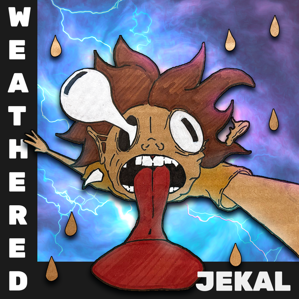
Weathered is an upcoming single from hip-hop recording artist Jekal. The song itself is a devastating tale of loss over a cartoonish instrumental. Jekal wanted a cover to reflet this raw emotion masked by a level of unseriousness, I began by sketching out some concepts and decided on a cartoon man who is falling through a storm while his body breaks down. With such a heavy concept it had to have a layer of levity to it so the man is a cartoon, hand-drawn on cardboard, and placed over a psychedelic storm. I also added a drop shadow to the character to add a level of disconnect between the protagonist and the situation, this is also the reason the storm doesn’t encompass the entire cover. This helps to hint that the storm is contained within the song and is not spilling over into reality.
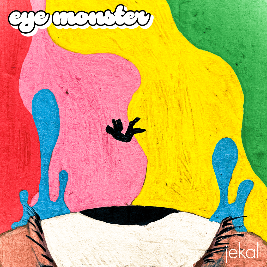
Eye Monster by Jekal is an upcoming EP that tells the story of an aging hip hop artist with a narcissus complex coming to terms with his mediocrity in life and in music. The titular eye monster is the view of the protagonist, in both the way he is perceived and the way he perceives himself. Throughout the project the protagonist is battling this eye monster and the ending is still a bit ambiguous on whether he has come to terms or stays in his delusion. The character in the album art is seemingly stuck between this ascent from and descent into the eye monsters grasp. While his body seems to be falling, the tears of the eye are rising. This leaves him in this perpetual limbo, never fully escaping nor succumbing, all while being surrounded by the bright lights and colors of the life he could live if his music were to take off.

My love for live performances has lead me to create posters for a multitude of artists. This poster in particular is for a show in a dive bar with three fairly distinct bands. Tsunami Samurai is a surf rock band, Vibrolas is a 3-piece band that is fast paced garage rock with a heavy bit of car centricity. Smiley Coyote doesn’t take itself too seriously with the mascot being a coyote wearing a hat with a hotdog on it, however, they are a mostly straight forward rock group with a large emphasis on the musicality of each member. The idea for this poster was to meld them all together in a style that would make sense for each group individually as well as a single unit. I decided on a hand lettered poster that would be reminiscent of 1980’s style local punk shows, for this style the hierarchy of information is incredibly important. With Tsunami Samurai being the headlining band and Mag Bar being the location, they both needed to be focal points. I decided on Tsunami Samurai being at the top and the trail of orange would lead viewer from the band name, through the “and” symbol, and into the bar’s name, large and in the center of the piece. Now anyone who reads this knows who is the headliner and where it is, if they are still interested they will see the other bands as well as the date, time, and price. After reading all the information they are introduced to the cartoons, which they may have overlooked prior but now hold more importance. There is a samurai sword, finger waves, Vibrolas name is on fire, a car burning tires, a hot dog, an excited coyote, rock hands, a guitar, some beer, and some weird mouth and eyes imagery. This should tell the viewer that this show will rock, it will be weird, there will be some Japanese influence, there will be beer, and how ever else people may interpret this imagery. They know what they are getting into when they go to this show.
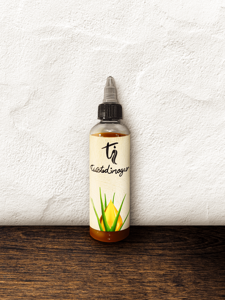
Twisted Images is an emerging hair care product that approached me with little more than a name. Together I worked with the owner to formulate a brand strategy, logo, logotype, and packaging for their product. Since the product is a natural oil with a central ingredient of aloe we decided on the aloe leaves being a large part of what sets this brand apart. We also decided on a logo that would spell out the initials of T.I. while abstractly representing hair and aloe leaves and a handwritten logotype that flows into itself. The packaging would also reflect this sentiment by having a painted texture to put the consumer in mind of its handcrafted creation process.
